I STARTED Early--Took my Dog--And visited the Sea--
The Mermaids in the Basement Came out to look at me
--Emily Dickinson

Wednesday, December 31, 2014

Some thoughts on my latest quilt canes...

I made quite a few quilt canes a month or two ago.  It's odd how different they can look when reduced and recombined.  Here, let me show you....

Take a look at this one:


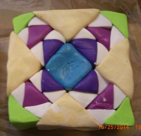
Now I think that the beige color triangles will make quite large squares when reduced and recombined.  So I thought I'd break it up a bit...I inserted orange and red squares in the corners near the center:


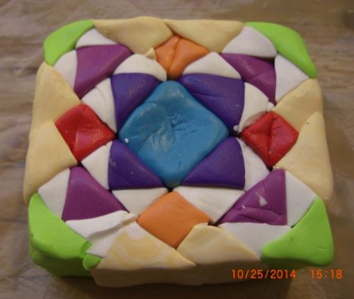
Well, that part worked, but now I have a different problem.  The blue center seems to overpower the rest of the colors and dominate the quilt cane.  That's not exactly what I wanted.


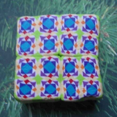
If I did this cane again, I'd probably sswap the dark blue triangles with the light green.  Or just leave the beige triangles alone.
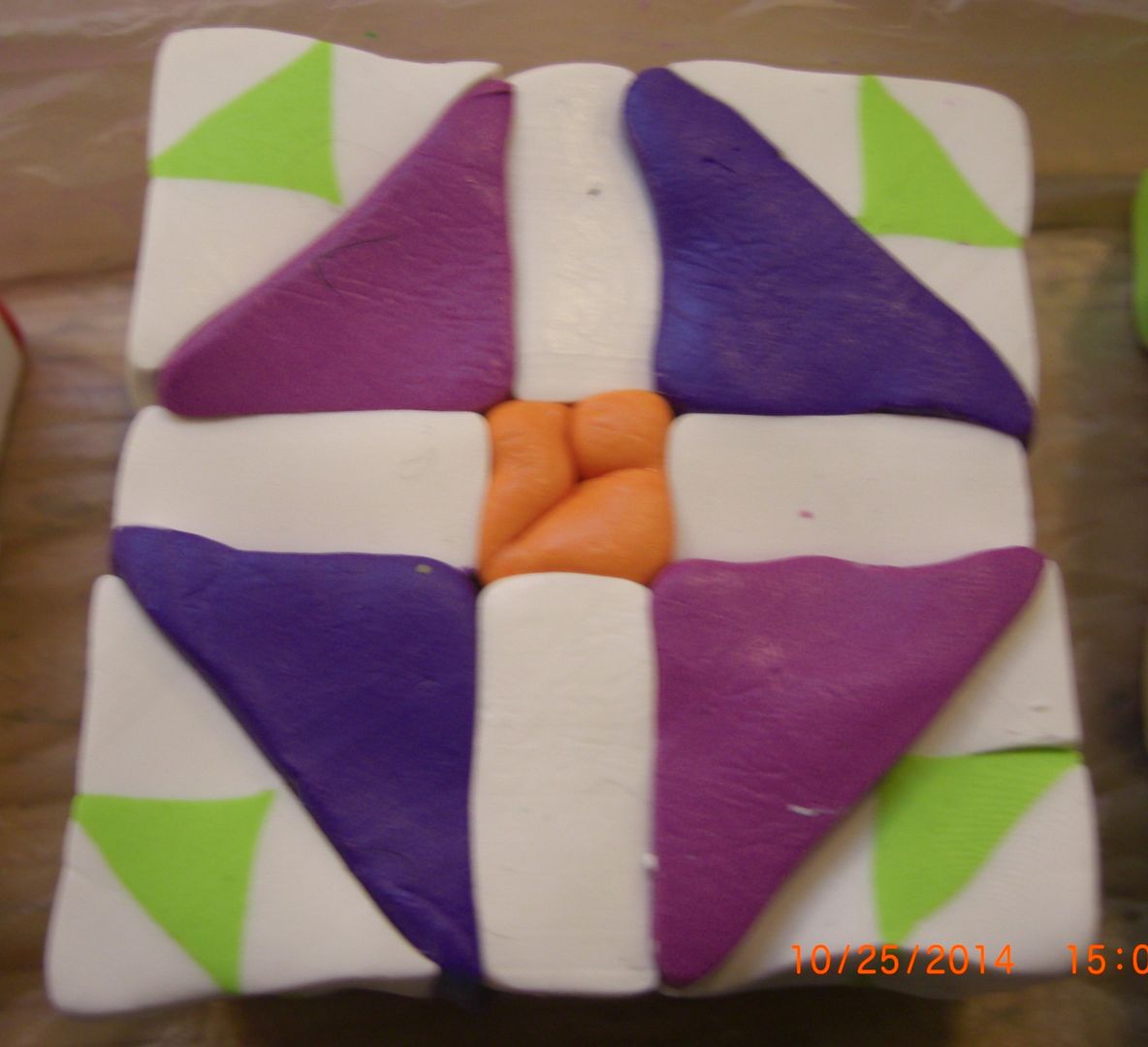
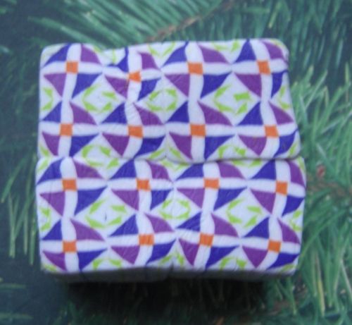
Here's another one:


The blue is predominate, but the white isn't too far behind...they seem to balance each other somewhat.  If you look at the block before it was reduced and combined, you can see that the blue triangle and the large white triangle on the opposite corner are the same size, so it makes sense that they balance each other to some extent in the recombined cane.  Darker colors can overpower lighter colors, even if they are the same amount in a cane.  When I look at this recombined cane, the blue seems to pop out more.


Still, I like it well enough, but it's not my favorite.  I'm not sure what I'd do differently if I made this one again...perhaps break up the large blue triangle.  Maybe put a smaller, lighter blue triangle within the larger blue triangle.  Or perhaps even white?

 Let's look at one more:


I like it best of the three.  It has good balance.  The dark and light areas don't overwhelm each other, yet the quilt pattern doesn't fade into the background and look blah:


A lot of it is personal preference, I suppose.  I don't know--which one do you like best?

Heh.  Bonus points if you know the quilt pattern names....

Tuesday, December 30, 2014

What a difference a little color makes...

Finally, there is this commission:


I did the one on the right a year or two ago.  It's white and translucent with the thinnest line of gold.  The one on the left was made for a commission this year.  It, too, is white and translucent--but with the thinnest line of silver.  It makes a HUGE difference....

Monday, December 29, 2014

Angel Commission...

Another commissioned piece (well, pieces):

Jewel box quilt pattern

Kaleidoscope quilt pattern

Sunday, December 28, 2014

Vespa Scooters...

Another commission came out of the blue...a lady at church and her husband collect Vespa Scooter ornaments and she wanted me to make one for her husband.  A quick google shows that there are a surprising amount.  Here's my version (well, versions...my first turned out awfully big, so I made a smaller one--she wanted both, so Yay!):

 
Sorry for the poor picture quality...I can't seem to remember to get pictures of these things until I deliver them.  Oh well....


For the record, her husband liked them. 

New Computer!

Sorry I've been away so long.  I needed a new computer and they are not easily afforded.  But I've finally got one, and I've updated my photo service, so I should be good to go.

I've been EXTREMELY busy!  I've had several commissions as well as the usual Christmas ornaments.  Now that Christmas is past and the commissions have gone to their new owners, I feel free to post pictures.

Here's the first one:


I've gotta say...it turned out much better than I planned!  Isn't it cute?  Here's a couple more views: